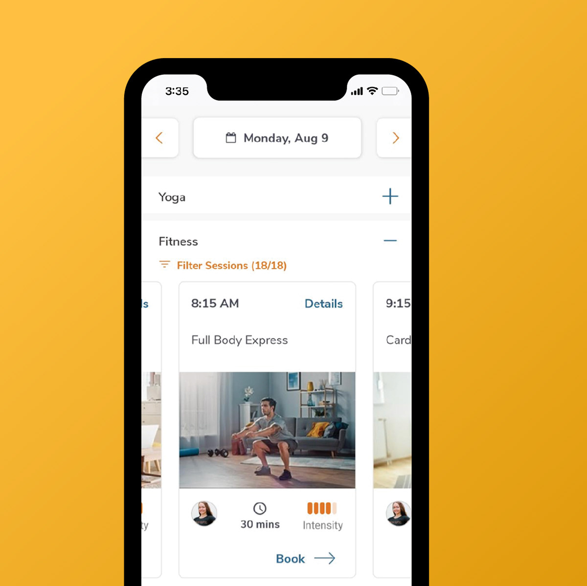
Boost employee wellness, connection and productivity with 7-minute live micro-breaks
ROLE: BRANDING | UI | EDITORIAL DESIGNER
While at 5&Vine
2021. Halifax, Canada.
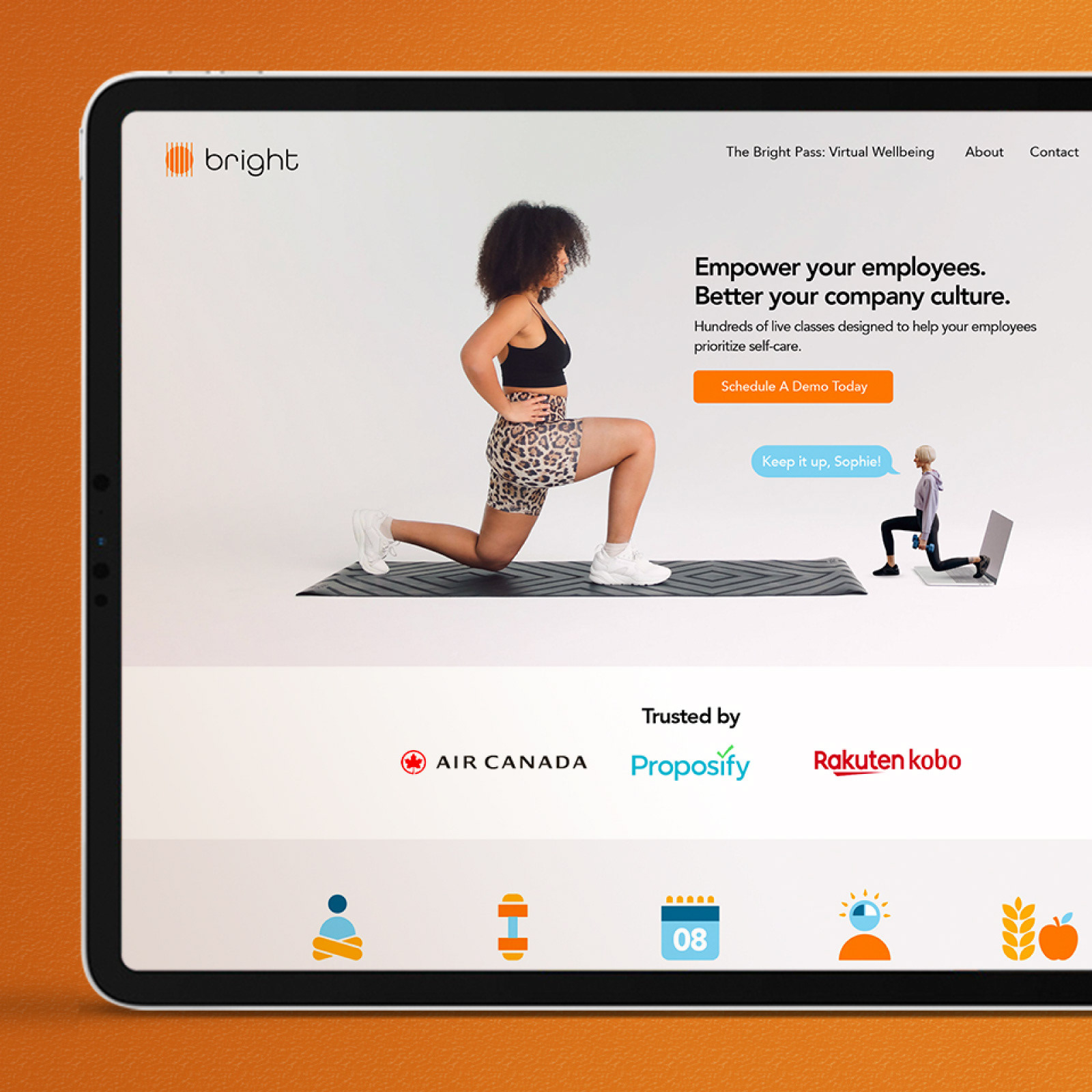
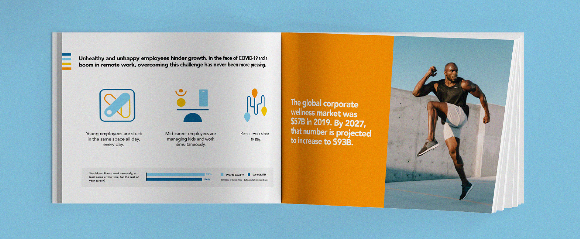
Cribcut engaged 5&Vine to help rename and rebrand their company, and support the launch of virtual services in the wake of COVD-19.
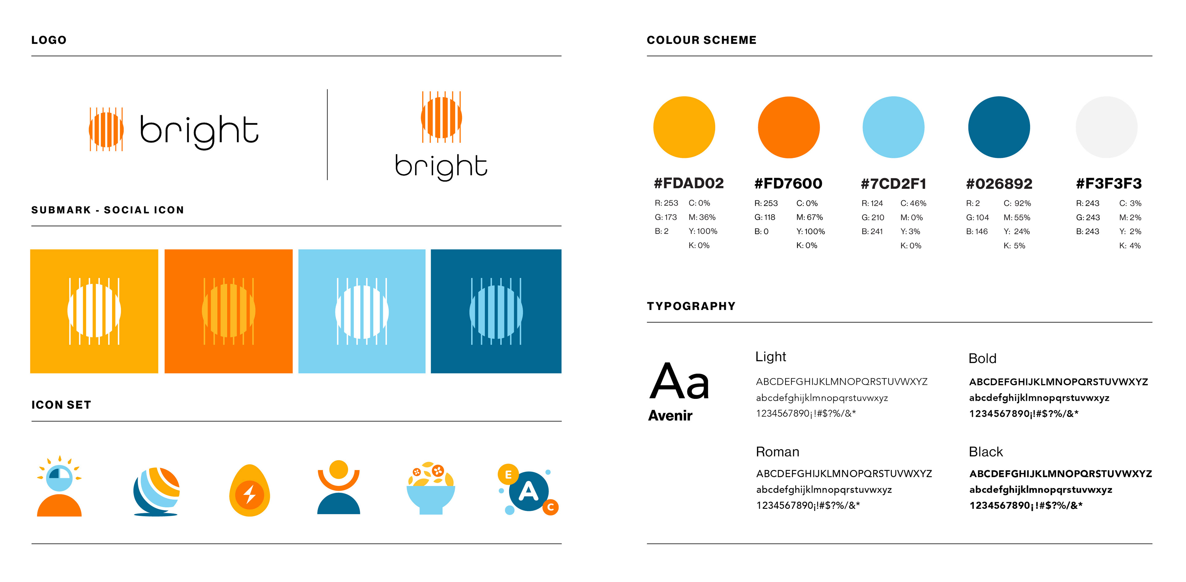
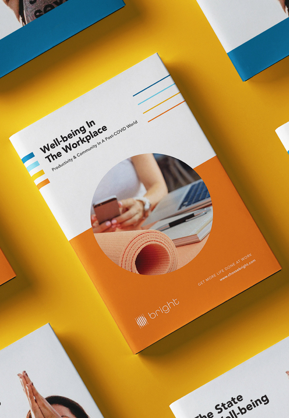
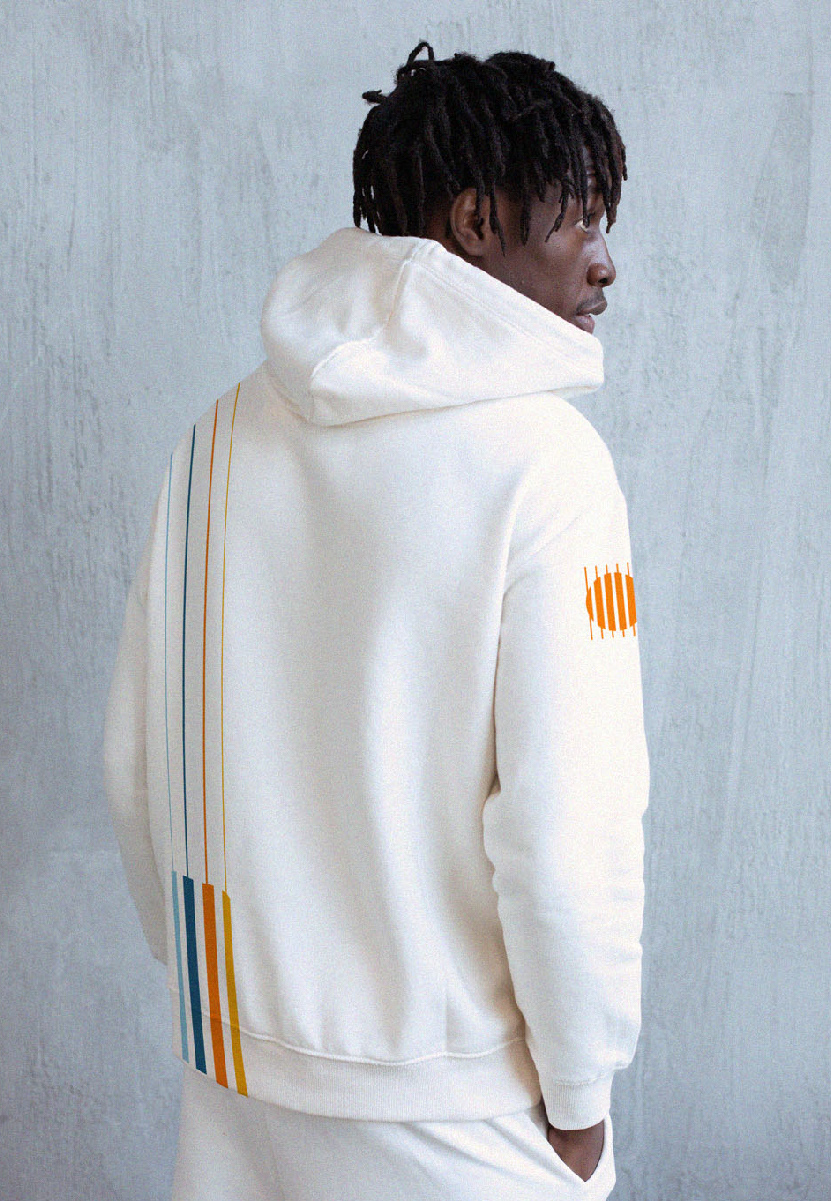
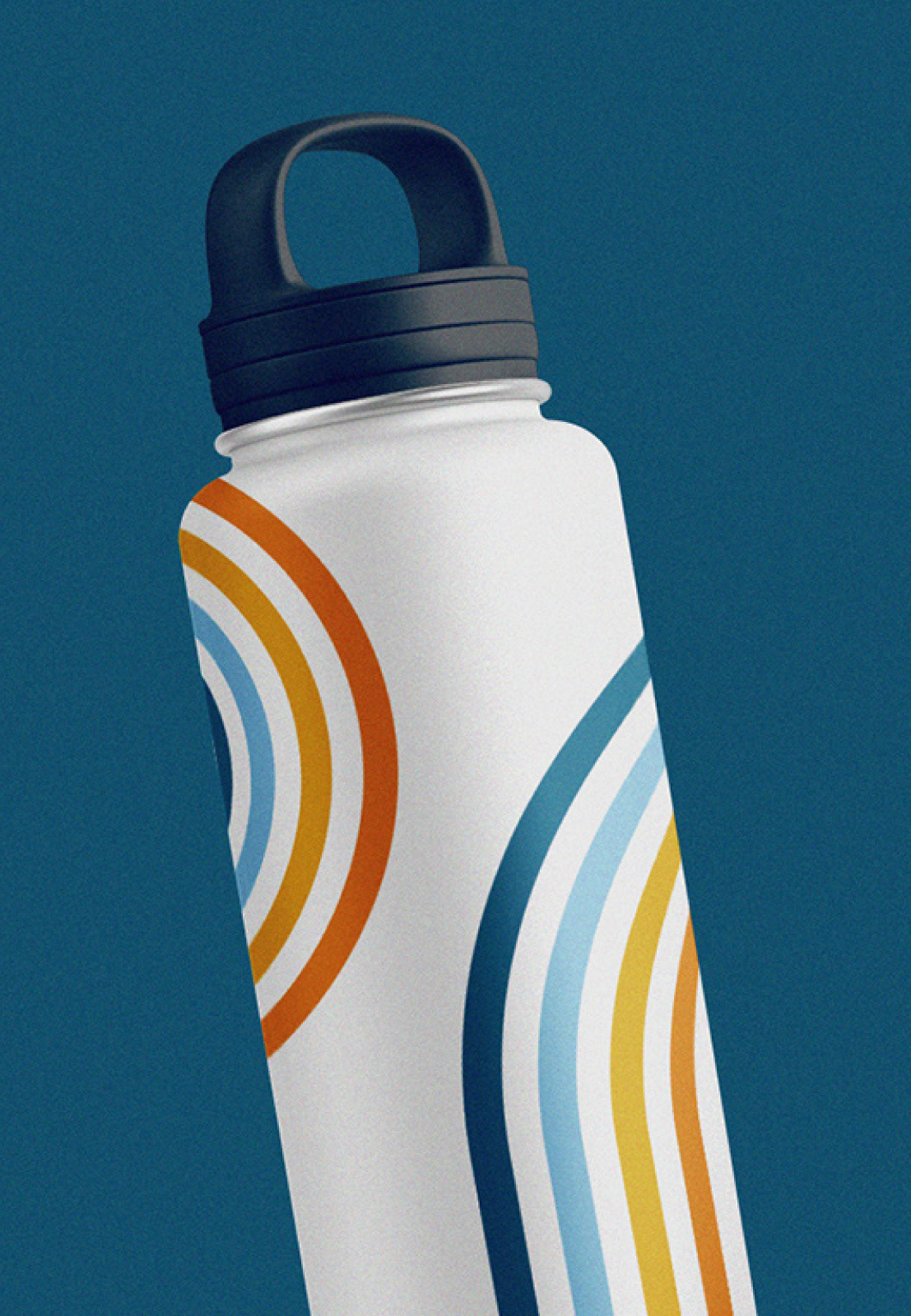
The rebrand process began with a rename. The team chose Bright to convey the brightness their services facilitate in someone’s day.
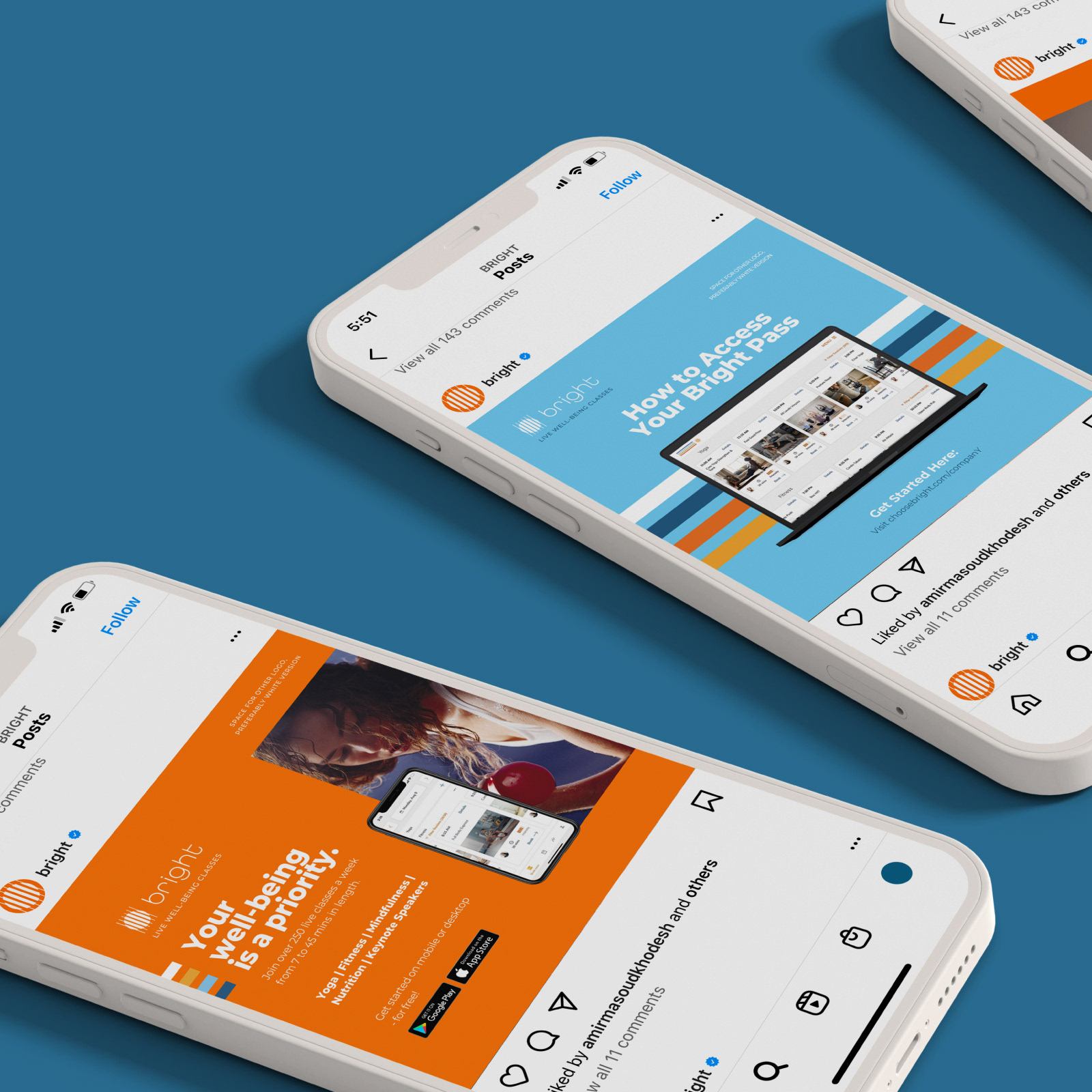

To bring this feeling to life, we designed a logo representing the sun as seen through vertical blinds. We complemented it with a vibrant color scheme, playful icons, and candid photography. Additionally, we developed a comprehensive brand guideline to ensure consistency across all external and internal touchpoints.

The result is a compelling new brand that has fuelled the organization’s adoption by Zenefits, WeWork, Mattel, ThompsonReuters and more.